This week let’s head to Finland and across the continent to the US.
If you would like your shot to go through this colum, please read here for instructions on how to submit. If you have already submitted a shot and it has not appeared yet, it will come soon !
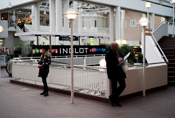
“Social Finns” by Eero Lethonen

Leica M8 with 35mm Summaron F2.8 at F4, ISO320
Composition
This must have been a difficult picture to compose. Indeed, lines are horizontal, vertical but also diagonal. They are located on several planes and the space between varies greatly from a few centimeters (fence) to several meters (columns). This creates a very busy frame where one’s look can easily get lost. Hopefully, the two main characters serve as anchors and soon our eyes goes from one to the other. This is further amplified by the two street lamps that echoes their presence. Note that the picture is perfectly right and lines do not converge, which is not always easy to achieve in a setting where our internal horizon line gets easily fooled. There is one detail that bothers me in this composition. Indeed, the head of the girl is overlapping the banner in the back. Indeed, her head mixes with the black of the banner and does not allow to clearly distinguish one from the other. Same effect happens somewhat with the man’s head as it meshes a bit with the bush in the background. To avoid it, Eero could have taken a low angle, yet the shot would have lost some of its depth. Finally, a slight crop to the left and right bottom part of the picture could leave out both of the street lamps that are partially cut. It would also take care of the foreground that is in my opinion a bit too large.
Aesthetics
The exposure is spot on though I wonder if a little over exposure would not have helped show more details on the subjects faces and postures. I like a lot the light generated by the two street lamps. The picture’s color space is quite cold, which probably fits with the mood tha Eero wanted to convey. The aperture used was F4.0 on the 1.3 crop sensor of the Leica M8. Eero should probably stopped down a bit more, to F5.6 or F8.0 as the girl resulted slightly out of focus. Note that he probably would have had to compensate the loss of light with an increase in the ISO.
Message / Mood / Meaning
Given the title of the shot “Social Finns”, Eero did an ironic portray of interaction between Finns in a public place. Yet the picture itself does not portray it very well since this is a scene that probably happens millions of times in our daily life. Why should people be social in a shopping or business center ? And why would Finns behave differently from citizens of other countries ? For a shot like this to work, it should take place in a place where interaction is expected but does not happen. Nothing in this shot makes us expect an interaction. Both people are busy with their stuff and it is normal to do so.
Opinion
This was a complex shot to compose and I think Eero did a good job overall. Some light and depth of field are missing on the subjects to read better their expressions. Where the picture fails is in the message conveyed. There is no interaction between them, nor should any be expected. It is in fact a portray of two people taking a break in a shopping center, which I am not sure is enough to make it relevant for a portray of social relations between Finns.
To discover more of Eero’s work, follow this link to his Flickr photostream.
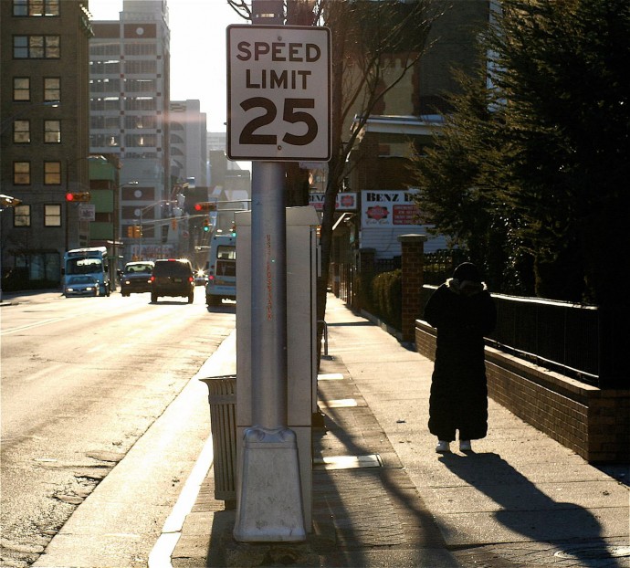
“Untitled”, by Richard Hankin

Canon Rebel 350D with Ultrasonic 35-135mm
Composition
Though it was shot with on a 3:2 camera, Richard elected to crop his shot to a 1:1 ratio. This choice was probably made to keep all action in a tight area of the picture. Indeed, there are three key elements in the picture which are a man, a street with traffic and a speed limit sign. The 1:1 ratio compresses them in a tight frame and probably took care of excess space on the sides. There is depth in the shot, and the sign in the first plane helps our mind to reconstruct the 3 dimensionality of the shot. That same sign also breaks the picture in two, that is the street on the left and the passer-by on the right. I think it was a good choice to place it in the middle, though it significance is unclear, but I’ll come back to that.
Aesthetics.
The light is nice as well as the color range. Richard mentioned that the lens used was a very old one, and the colors are indeed typical of a vintage lens. There is also some flare on the upper part of the picture which in this case is a welcome addition to the look of the picture. There are some burnt highlights on the street and in the sky. I don’t mind about the ones in the sky as it would have been difficult to avoid due to the high contrast scene. Nevertheless, the burnt highlights on the concrete bother me a bit as it gives a digital look to that part of the picture. This apart, I like the mood of the left part of the picture. What I am less convinced about, is the right part since I find it a bit too dark. Indeed, unless one looks at the feet of the passer-by, it is difficult to see where he is headed. In fact, the whole character is buried in a dark mass which differs too much from the left part of the picture. I do like the shadow drawn on the sidewalk though but would have like it to have it included fully in the frame.
Meaning / mood / feelings
This picture is difficult to understand, mainly because of the passer-by. Not that he should be doing specific but, be it its body language or the lack of detail does not allow a clear reading on his whereabouts. Another difficult element to interpret is the speed limit sign. Is there a special meaning to it (city limits, slow path of life ?) or is it just place there as a compositional element ? In other words, is the whole scene a simple shot of a moment of life in a city, or did its author want to convey a specific message through the elements located in the frame. I could not come to a conclusion myself.
Opinion
The composition works well, so does the light on the left of the picture, yet he right part of the picture is too contrasty. In turn, it does not allow to interpret the whereabouts of the main character, so the history portrayed in that shot is difficult to understand. Richard did not provide a title or this shot, it could probably help to read it if chosen adequately. I’d also be interested to see the original 3:2 shot and, as famous Walker Evans used to do in his US cityscapes, see if there were more than one way to crop this shot.
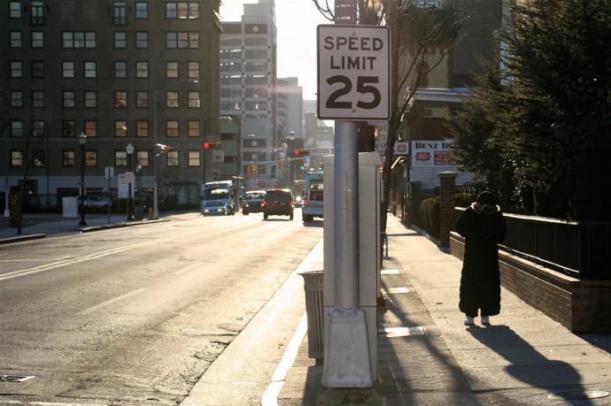
PS : Richard sent me the uncropped file after I published this column. In some ways, I do like it better though a position slightly more on the left would have given more depth on the avenue. Note the great light on the windows of the building.
